How to Make a Website Mobile Friendly: Complete Guide
By Nishant · · 10 min read
How to Make a Website Mobile Friendly
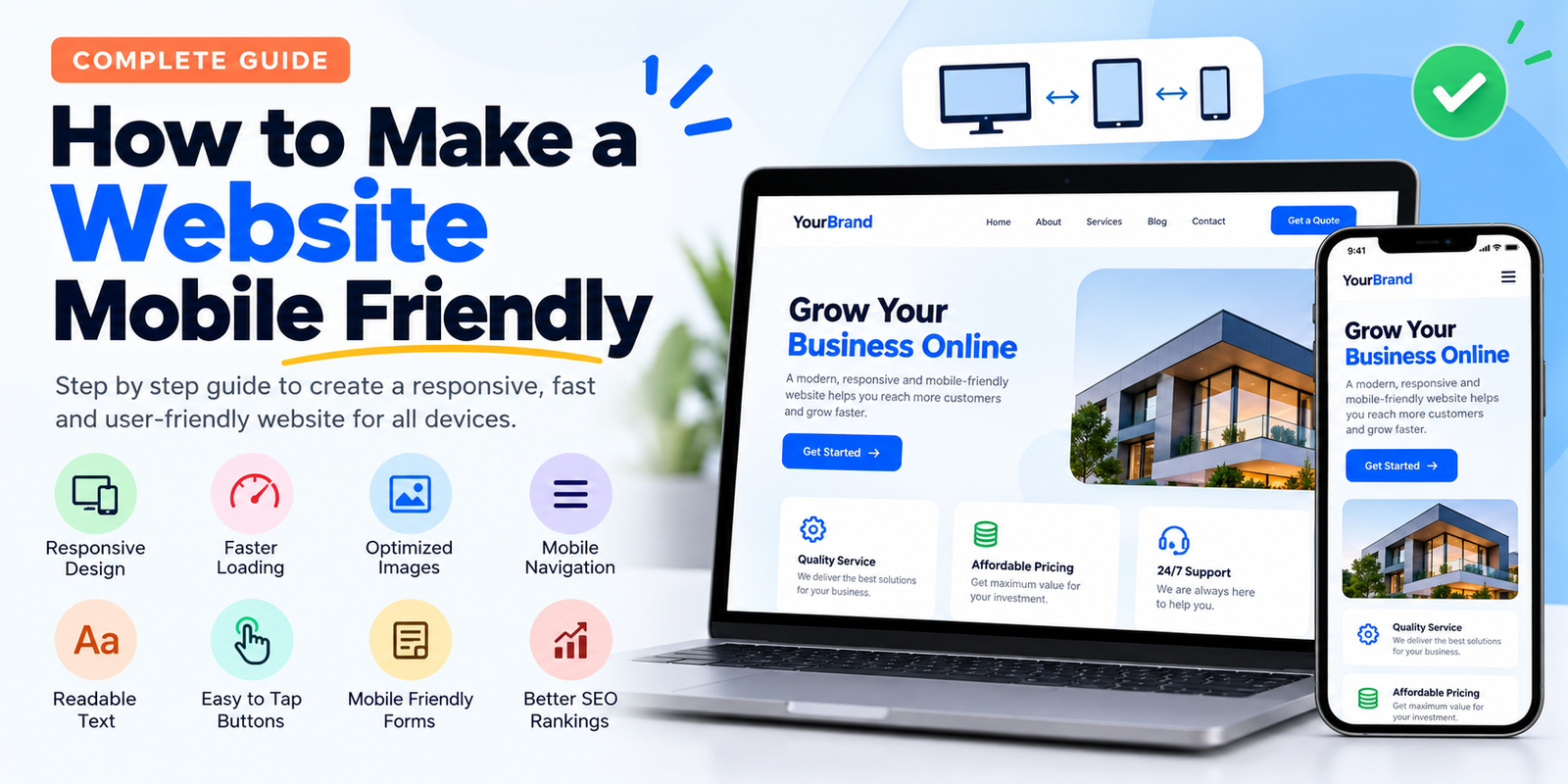
If your website looks good on a laptop but becomes difficult to use on a phone, you have a mobile usability problem. Text may be too small, buttons may be difficult to tap, images may overflow the screen, or visitors may have to zoom in and out just to read the content.
A mobile-friendly website does not simply mean making everything smaller. The layout, navigation, images, buttons, forms, and page speed all need to work properly on a small screen.
The good news is that you usually do not need to rebuild an entire website. In many cases, a few changes to the CSS, HTML, images, navigation and page structure can make a significant difference.
What Does Mobile Friendly Mean?
A mobile-friendly website automatically adapts its layout to different screen sizes. A visitor using a 360px-wide phone should be able to read the page and interact with it without horizontal scrolling or excessive zooming.
A properly optimized mobile website should have:
- Readable text without zooming
- Buttons that are easy to tap
- A navigation menu that works on small screens
- Images that fit inside the screen
- Forms that are easy to complete
- Fast loading pages
- No unwanted horizontal scrolling
- Content that remains accessible on smaller screens
1. Add the Viewport Meta Tag
One of the first things to check is whether your website has the viewport meta tag. Without it, mobile browsers may render the page as though it were designed for a desktop screen.
Add this inside the <head> section of your HTML:
<meta name="viewport" content="width=device-width, initial-scale=1.0">This tells the browser to use the device's actual screen width and allows your responsive CSS to work correctly.
2. Use Responsive CSS Instead of Fixed Widths
A common reason websites break on phones is the use of fixed widths. For example, this can cause problems:
.container {
    width: 1200px;
}
A phone may only be around 360 to 430 pixels wide, so a 1200px container creates horizontal scrolling.
Use flexible widths instead:
.container {
    width: 100%;
    max-width: 1200px;
    margin: 0 auto;
    padding: 0 20px;
    box-sizing: border-box;
}
The max-width prevents the content from becoming unnecessarily wide on desktop, while
width: 100% allows it to shrink on smaller screens.
3. Add Media Queries for Smaller Screens
Responsive websites normally use CSS media queries to change the layout at different screen widths.
For example:
.services {
    display: grid;
    grid-template-columns: repeat(3, 1fr);
    gap: 25px;
}

@media (max-width: 768px) {
    .services {
        grid-template-columns: 1fr;
    }
}
On a desktop screen, three service boxes can appear in one row. On a phone, they become a single column. This is much easier to use than forcing three narrow boxes onto a small screen.
4. Make Images Responsive
Large fixed-size images can also create horizontal scrolling. A simple CSS rule can prevent most images from becoming wider than their containers.
img {
    max-width: 100%;
    height: auto;
    display: block;
}
The image can now shrink with its parent container while maintaining its original proportions.
You should also avoid uploading a 5000px-wide image when the website only displays it at 800px. Resize images before uploading them and use modern formats such as WebP or AVIF where appropriate.
5. Fix Your Website Navigation
Desktop navigation menus often contain several links in a single horizontal row. That approach does not always work well on phones.
A mobile menu should be easy to open and close, and important links should remain accessible. Avoid tiny navigation links packed closely together.
A basic mobile navigation approach could look like this:
nav ul {
    display: flex;
    gap: 25px;
    list-style: none;
}

@media (max-width: 768px) {
    nav ul {
        flex-direction: column;
        gap: 12px;
    }
}
For larger websites, you can use a hamburger menu controlled by JavaScript. The important part is that visitors should be able to find your main pages without struggling with a desktop-style menu.
6. Use Readable Font Sizes
Tiny text is one of the fastest ways to make a mobile website frustrating to use. Avoid designing your mobile website around desktop-sized layouts and then shrinking everything.
A comfortable starting point for normal body text is around 16px, although the correct size depends on the font and design.
body {
    font-size: 16px;
    line-height: 1.6;
}
Headings should also scale appropriately. You can use responsive CSS to reduce very large desktop headings:
h1 {
    font-size: 48px;
}

@media (max-width: 768px) {
    h1 {
        font-size: 32px;
    }
}
7. Make Buttons Easy to Tap
A button that looks fine with a mouse can be difficult to use with a finger. Avoid placing several tiny buttons directly beside each other.
Give important buttons enough padding:
.button {
    display: inline-block;
    padding: 12px 20px;
    font-size: 16px;
    border-radius: 6px;
}
Pay particular attention to phone numbers, WhatsApp buttons, appointment buttons, checkout buttons and contact forms. These are often the actions that matter most to visitors.
8. Prevent Horizontal Scrolling
If visitors have to swipe left and right to see the entire page, something in your layout is probably wider than the viewport.
Common causes include:
- Fixed-width containers
- Large images
- Long unbroken text
- Wide tables
- Desktop navigation menus
- Third-party widgets
- Elements positioned outside the viewport
Do not automatically solve every problem by adding overflow-x: hidden. That can hide the symptom
without fixing the element that is actually causing the overflow.
Find the oversized element and make its width responsive instead.
9. Optimize Website Speed for Mobile Users
Mobile visitors may be using slower connections or less powerful devices than desktop users. A page that feels fast on your computer can still feel slow on a phone.
Start with these improvements:
- Compress large images
- Use WebP or AVIF where appropriate
- Remove unnecessary JavaScript
- Remove unused CSS
- Enable browser caching
- Use a CDN when appropriate
- Lazy-load images below the initial viewport
- Reduce unnecessary third-party scripts
Do not focus only on the final page size. JavaScript execution, server response time and third-party scripts can also affect how quickly a page becomes usable.
10. Make Forms Mobile Friendly
Contact and enquiry forms are frequently overlooked during mobile optimization.
Use full-width inputs on smaller screens and give users enough space to enter information.
input,
textarea,
select {
    width: 100%;
    padding: 12px;
    font-size: 16px;
    box-sizing: border-box;
}

@media (max-width: 768px) {
    .form-row {
        display: block;
    }
}
Use appropriate HTML input types as well. For example, use type="email" for email addresses and
type="tel" for phone numbers. Mobile browsers can then provide more appropriate keyboards.
11. Do Not Hide Important Content on Mobile
Responsive design sometimes goes too far. Developers may hide large sections of content simply because they do not fit the desktop layout.
Mobile users should still be able to access important information such as product details, services, pricing, contact information, navigation and useful supporting content.
Instead of removing useful content, redesign the section so that it works vertically on smaller screens.
12. Check Tables and Other Wide Elements
Tables are particularly difficult on small screens. If a table contains many columns, consider whether all of those columns are necessary.
Another option is to allow the table itself to scroll horizontally while keeping the rest of the page responsive:
.table-wrapper {
    width: 100%;
    overflow-x: auto;
}

.table-wrapper table {
    min-width: 600px;
}
This is better than allowing the entire webpage to become wider than the phone screen.
13. Use Flexible CSS Units
You do not have to use pixels for everything. Responsive units such as percentages, rem,
em, vw, vh and CSS functions such as clamp() can help
create layouts that adapt more naturally.
For example:
h1 {
    font-size: clamp(32px, 5vw, 56px);
}
This allows the heading to scale with the viewport while keeping it within a sensible minimum and maximum size.
14. Test the Website on Real Phones
A website that looks perfect in a desktop browser is not necessarily mobile friendly. Test the actual pages on different phones whenever possible.
Check the following:
- Can you read the text without zooming?
- Can you open the navigation menu?
- Can you tap every important button?
- Do images fit within the screen?
- Does the page scroll horizontally?
- Can you complete the contact form?
- Does the page load quickly?
- Are important elements hidden behind popups?
15. Test Different Screen Sizes in Your Browser
You can also use the responsive device tools built into modern browsers. Open your website in Chrome, open Developer Tools, and switch to the device toolbar.
Test common viewport widths such as 320px, 360px, 375px, 390px, 414px and 768px. Do not test only one phone size because a layout that works at 390px can still break at 320px.
A Simple Mobile-Friendly HTML Structure
If you are building a new HTML website, start with a responsive structure instead of trying to repair a desktop layout later.
<!DOCTYPE html>
<html lang="en">
<head>
    <meta charset="UTF-8">
    <meta name="viewport"
          content="width=device-width, initial-scale=1.0">

    <title>Mobile Friendly Website</title>

    <style>
        * {
            box-sizing: border-box;
        }

        body {
            margin: 0;
            font-family: Arial, sans-serif;
            line-height: 1.6;
        }

        .container {
            width: 100%;
            max-width: 1200px;
            margin: auto;
            padding: 0 20px;
        }

        .hero {
            padding: 80px 20px;
            text-align: center;
        }

        .cards {
            display: grid;
            grid-template-columns: repeat(3, 1fr);
            gap: 20px;
        }

        .card {
            padding: 25px;
            border: 1px solid #ddd;
        }

        img {
            max-width: 100%;
            height: auto;
        }

        @media (max-width: 768px) {
            .hero {
                padding: 50px 20px;
            }

            .cards {
                grid-template-columns: 1fr;
            }

            h1 {
                font-size: 32px;
            }
        }
    </style>
</head>

<body>

    <header>
        <div class="container">
            <h2>My Website</h2>
        </div>
    </header>

    <main>

        <section class="hero">
            <div class="container">
                <h1>Welcome to My Website</h1>
                <p>
                    A responsive website that works across desktop,
                    tablet and mobile devices.
                </p>
            </div>
        </section>

        <section>
            <div class="container">

                <div class="cards">

                    <div class="card">
                        <h2>Service One</h2>
                        <p>Description of the service.</p>
                    </div>

                    <div class="card">
                        <h2>Service Two</h2>
                        <p>Description of the service.</p>
                    </div>

                    <div class="card">
                        <h2>Service Three</h2>
                        <p>Description of the service.</p>
                    </div>

                </div>

            </div>
        </section>

    </main>

</body>
</html>
Common Mobile-Friendly Mistakes
Simply adding a viewport tag does not make a website mobile friendly. The rest of the layout still needs to adapt.
Avoid these common mistakes:
- Using fixed desktop widths everywhere
- Uploading unnecessarily large images
- Using very small buttons
- Keeping a complicated desktop navigation on mobile
- Using huge headings that dominate the screen
- Allowing third-party widgets to overflow the viewport
- Hiding important content instead of restructuring it
- Testing only on a desktop computer
- Adding too many popups on mobile
Mobile-Friendly Website Checklist
Before publishing your website, run through this checklist:
- Viewport meta tag is present
- Content fits the screen without horizontal scrolling
- Images resize correctly
- Navigation works on mobile
- Text is readable
- Buttons are easy to tap
- Forms are usable
- Important content is available on mobile
- Images are compressed and appropriately sized
- Unnecessary scripts have been removed
- Pages have been tested at multiple screen widths
- The website has been tested on actual mobile devices
Final Thoughts
Making a website mobile friendly is mainly about removing obstacles. Visitors should not have to zoom, drag the page sideways, fight with tiny buttons or wait unnecessarily for large files to load.
Start with the viewport setting, then fix fixed-width layouts, responsive images, navigation, typography, buttons and forms. After that, work on performance and test the complete website at several screen sizes.
The goal is not to create a separate website for phones. The goal is to build one website that intelligently adapts to the device being used.